背景
Jetpack Compose 提供了强大的 Material Design 组件,其中 TabRow 组件可以用于实现 Material Design 规范的选项卡界面。但是默认的 TabRow 样式可能无法满足所有场景,所以我们有时需要自定义 TabRow 的样式。
Jetpack Compose 中使用 TabRow
简单使用 TabRow 一般可以分为以下几步:
-
定义 Tab 数据模型
每个 Tab 对应一个数据类,包含标题、图标等信息:
kotlin"> data class TabItem( val title: String, val icon: ImageVector? ) -
在 TabRow 中添加 Tab 项
使用 Tab 组件添加选项卡,传入标题、图标等:
kotlin"> TabRow { tabItems.forEach { item -> Tab( text = { Text(item.title) }, icon = { item.icon?.let { Icon(it) } } ) } } -
处理 Tab 选择事件
通过
selectedTabIndex跟踪选中的 tab,在onTabSelected回调中处理点击事件:kotlin">var selectedTabIndex by remember { mutableStateOf(0) } TabRow( selectedTabIndex = selectedTabIndex, onTabSelected = { selectedTabIndex = it } ){ // ... }
具体详细可以看我之前的文章 Jetpack Compose TabRow与HorizontalPager 联动
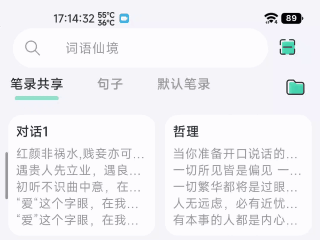
笔记共享App
我新开发的笔记共享App 也用上了TabRow与HorizontalPager联动效果
效果图
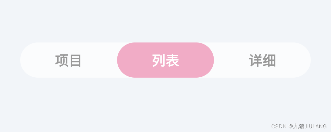
自定义 TabRow 的样式
效果图

演示图的姓名都是随机生成的,如有雷同纯属巧合
证据如下
kotlin">val lastNames = arrayOf(
"赵", "钱", "孙", "李", "周", "吴", "郑", "王", "刘", "张", "杨", "陈", "郭", "林", "徐", "罗", "陆", "海"
)
val firstNames = arrayOf(
"伟", "芳", "娜", "敏", "静", "立", "丽", "强", "华", "明", "杰", "涛", "俊", "瑶", "琨", "璐"
)
val secondNames =
arrayOf("燕", "芹", "玲", "玉", "菊", "萍", "倩", "梅", "芳", "秀", "苗", "英")
// 随机选择一个姓氏
val lastName = lastNames.random()

// 随机选择一个名字
val firstName = firstNames.random()
val secondName = secondNames.random()
代码解释
重写TabRow
通过查看TabRow 组件的源代码 ,单单自定义indicator 指示器是行不通的
kotlin"> layout(tabRowWidth, tabRowHeight) {
                //绘制 tab文本
                tabPlaceables.forEachIndexed { index, placeable ->
                    placeable.placeRelative(index * tabWidth, 0)
                }
                //绘制 divider 分割线
                subcompose(TabSlots.Divider, divider).forEach {
                    val placeable = it.measure(constraints.copy(minHeight = 0))
                    placeable.placeRelative(0, tabRowHeight - placeable.height)
                }
                //最后绘制 Indicator 指示器
                subcompose(TabSlots.Indicator) {
                    indicator(tabPositions)
                }.forEach {
                    it.measure(Constraints.fixed(tabRowWidth, tabRowHeight)).placeRelative(0, 0)
                }
            }
根据源代码可以看出TabRow 先绘制文本 再绘制 指示器,这的显示效果,当Indicator高度充满TabRow的时候Tab文本是显示不出来的,因为Indicator挡住了,

所以解决办法就是先绘制Indicator再绘制tab文本
kotlin"> layout(tabRowWidth, tabRowHeight) {
                 //先绘制 Indicator 指示器
                subcompose(TabSlots.Indicator) {
                    indicator(tabPositions)
                }.forEach {
                    it.measure(Constraints.fixed(tabRowWidth, tabRowHeight)).placeRelative(0, 0)
                }
                //因为divider用不上,我便注释了
                //subcompose(TabSlots.Divider, divider).forEach {
                //    val placeable = it.measure(constraints.copy(minHeight = 0))
                //    placeable.placeRelative(0, tabRowHeight - placeable.height)
                //}

                //再绘制 tab文本
                tabPlaceables.forEachIndexed { index, placeable ->
                    placeable.placeRelative(index * tabWidth, 0)
                }

            }
把TabRow宽度改成由内容匹配
未修改时的TabRow宽度由父布局决定,效果图如下
TabRow的宽度从源码上看是,直接获取SubcomposeLayout的最大宽度(constraints.maxWidth)
接着利用宽度和tabCount计算平均值,就是每个tab文本的宽度
kotlin">SubcomposeLayout(Modifier.fillMaxWidth()) { constraints ->

            //最大宽度
            val tabRowWidth = constraints.maxWidth
            val tabMeasurables = subcompose(TabSlots.Tabs, tabs)
            val tabCount = tabMeasurables.size
            var tabWidth = 0
            if (tabCount > 0) {
                tabWidth = (tabRowWidth / tabCount)
            }
            ...
            }
我们需要TabRow宽度由内容匹配,而不是父布局的最大宽度,这样就要修改测量流程\
不再直接使用constraints.maxWidth作为tabRowWidth,而是记为最大宽度maxWidth
接着封装一个函数,使用标签内容宽度的求和作为 TabRow 的宽度,不再和 maxWidth 做比较
kotlin">fun measureTabRow(
    measurables: List<Measurable>,
    minWidth: Int
): Int {
    // 依次测量标签页宽度并求和
    val widths = measurables.map {
        it.minIntrinsicWidth(Int.MAX_VALUE)
    }
    var width = widths.max() * measurables.size
    measurables.forEach {
        width += it.minIntrinsicWidth(Int.MAX_VALUE)
    }
    //maxWidth的作用
    // 如果标签较多,可以取一个较小值作为最大标签宽度,防止过宽
    return minOf(width, minWidth)
}

这样就舒服多了
自定义的 Indicator
主要逻辑是在 Canvas 上绘制指示器
- indicator 的宽度根据当前 tab 的宽度及百分比计算
- indicator 的起始 x 轴坐标根据切换进度在当前 tab 和前/后 tab 之间插值
- indicator 的高度是整个 Canvas 的高度,即占据了 TabRow 的全高
fraction 和前后 tab 的 lerping 实现了滑动切换时指示器平滑过渡的效果
具体可以看代码的注释
使用方法
kotlin">//默认显示第一页
val pagerState = rememberPagerState(initialPage = 1,  pageCount = { 3 } )

 WordsFairyTabRow(
            modifier = Modifier
                .align(Alignment.BottomCenter)
                .padding(bottom = 86.dp, start = 24.dp, end = 24.dp),
            selectedTabIndex = pagerState.currentPage,
            indicator = { tabPositions ->
                if (tabPositions.isNotEmpty()) {
                    PagerTabIndicator(tabPositions = tabPositions, pagerState = pagerState)
                }
            },
        ) {
            // 添加选项卡
            tabs.forEachIndexed { index, title ->
                val selected = (pagerState.currentPage == index)
                Tab(
                    selected = selected,
                    selectedContentColor = WordsFairyTheme.colors.textWhite,
                    unselectedContentColor = WordsFairyTheme.colors.textSecondary,
                    onClick = {
                        scope.launch {
                            feedback.vibration()
                            pagerState.animateScrollToPage(index)
                        }
                    },
                    modifier = Modifier.wrapContentWidth() // 设置Tab的宽度为wrapContent
                ) {
                    Text(
                        text = title,
                        fontWeight = FontWeight.Bold,
                        modifier = Modifier.padding(9.dp)
                    )
                }
            }
        }
完整代码
PagerTabIndicator.kt
kotlin">@OptIn(ExperimentalFoundationApi::class)
@Composable
fun PagerTabIndicator(
    tabPositions: List<TabPosition>, // TabPosition列表
    pagerState: PagerState, // PageState用于获取当前页和切换进度
    color: Color = WordsFairyTheme.colors.themeUi, // 指示器颜色
    @FloatRange(from = 0.0, to = 1.0) percent: Float = 1f // 指示器宽度占Tab宽度的比例
) {

    // 获取当前选中的页和切换进度
    val currentPage by rememberUpdatedState(newValue = pagerState.currentPage)
    val fraction by rememberUpdatedState(newValue = pagerState.currentPageOffsetFraction)

    // 获取当前tab、前一个tab、后一个tab的TabPosition
    val currentTab = tabPositions[currentPage]
    val previousTab = tabPositions.getOrNull(currentPage - 1)
    val nextTab = tabPositions.getOrNull(currentPage + 1)

    Canvas(
        modifier = Modifier.fillMaxSize(), // 充满TabRow的大小
        onDraw = {
            // 计算指示器宽度
            val indicatorWidth = currentTab.width.toPx() * percent

            // 计算指示器x轴起始位置
            val indicatorOffset = if (fraction > 0 && nextTab != null) {
                // 正在向右滑动到下一页,在当前tab和下一tab之间插值
                lerp(currentTab.left, nextTab.left, fraction).toPx()
            } else if (fraction < 0 && previousTab != null) {
                // 正在向左滑动到上一页,在当前tab和上一tab之间插值
                lerp(currentTab.left, previousTab.left, -fraction).toPx()
            } else {
                // 未在滑动,使用当前tab的left
               currentTab.left.toPx()
            }

            // 绘制指示器
            val canvasHeight = size.height // 高度为整个Canvas高度
            drawRoundRect(
                color = color,
                topLeft = Offset( // 设置圆角矩形的起始点
                    indicatorOffset + (currentTab.width.toPx() * (1 - percent) / 2),
                    0F
                ),
                size = Size( // 设置宽高
                    indicatorWidth + indicatorWidth * abs(fraction),
                    canvasHeight
                ),
                cornerRadius = CornerRadius(26.dp.toPx()) // 圆角半径
            )
        }
    )
}
WordsFairyTabRow.kt
kotlin">@Composable
fun WordsFairyTabRow(
    selectedTabIndex: Int,
    modifier: Modifier = Modifier,
    indicator: @Composable (tabPositions: List<TabPosition>) -> Unit = @Composable { tabPositions ->
        if (selectedTabIndex < tabPositions.size) {
            TabRowDefaults.Indicator(
                Modifier.tabIndicatorOffset(tabPositions[selectedTabIndex])
            )
        }
    },
    tabs: @Composable () -> Unit
) {


    ImmerseCard(
        modifier = modifier.selectableGroup(),
        shape = RoundedCornerShape(26.dp),
        backgroundColor = WordsFairyTheme.colors.whiteBackground.copy(alpha = 0.7f)
    ) {
        SubcomposeLayout(Modifier.wrapContentWidth()) { constraints ->

            val tabMeasurables = subcompose(TabSlots.Tabs, tabs)
            val tabRowWidth = measureTabRow(tabMeasurables, constraints.maxWidth)

            val tabCount = tabMeasurables.size
            var tabWidth = 0
            if (tabCount > 0) {
                tabWidth = (tabRowWidth / tabCount)
            }
            val tabRowHeight = tabMeasurables.fold(initial = 0) { max, curr ->
                maxOf(curr.maxIntrinsicHeight(tabWidth), max)
            }

            val tabPlaceables = tabMeasurables.map {
                it.measure(
                    constraints.copy(
                        minWidth = tabWidth,
                        maxWidth = tabWidth,
                        minHeight = tabRowHeight,
                        maxHeight = tabRowHeight,
                    )
                )
            }

            val tabPositions = List(tabCount) { index ->
                TabPosition(tabWidth.toDp() * index, tabWidth.toDp())
            }

            layout(tabRowWidth, tabRowHeight) {

                subcompose(TabSlots.Indicator) {
                    indicator(tabPositions)
                }.forEach {
                    it.measure(Constraints.fixed(tabRowWidth, tabRowHeight)).placeRelative(0, 0)
                }

                tabPlaceables.forEachIndexed { index, placeable ->
                    placeable.placeRelative(index * tabWidth, 0)
                }

            }
        }

    }
}

fun measureTabRow(
    measurables: List<Measurable>,
    minWidth: Int
): Int {
    // 依次测量标签页宽度并求和
    val widths = measurables.map {
        it.minIntrinsicWidth(Int.MAX_VALUE)
    }
    var width = widths.max() * measurables.size
    measurables.forEach {
        width += it.minIntrinsicWidth(Int.MAX_VALUE)
    }

    // 如果标签较多,可以取一个较小值作为最大标签宽度,防止过宽
    return minOf(width, minWidth)
}

@Immutable
class TabPosition internal constructor(val left: Dp, val width: Dp) {
    val right: Dp get() = left + width

    override fun equals(other: Any?): Boolean {
        if (this === other) return true
        if (other !is TabPosition) return false

        if (left != other.left) return false
        if (width != other.width) return false

        return true
    }

    override fun hashCode(): Int {
        var result = left.hashCode()
        result = 31 * result + width.hashCode()
        return result
    }

    override fun toString(): String {
        return "TabPosition(left=$left, right=$right, width=$width)"
    }
}

/**
 * Contains default implementations and values used for TabRow.
 */
object TabRowDefaults {
    /** Default container color of a tab row. */
    val containerColor: Color
        @Composable get() =
            WordsFairyTheme.colors.whiteBackground

    /** Default content color of a tab row. */
    val contentColor: Color
        @Composable get() =
            WordsFairyTheme.colors.whiteBackground

    @Composable
    fun Indicator(
        modifier: Modifier = Modifier,
        height: Dp = 3.0.dp,
        color: Color =
            WordsFairyTheme.colors.navigationBarColor

    ) {
        Box(
            modifier
                .fillMaxWidth()
                .height(height)
                .background(color = color)
        )
    }
    fun Modifier.tabIndicatorOffset(
        currentTabPosition: TabPosition
    ): Modifier = composed(
        inspectorInfo = debugInspectorInfo {
            name = "tabIndicatorOffset"
            value = currentTabPosition
        }
    ) {
        val currentTabWidth by animateDpAsState(
            targetValue = currentTabPosition.width,
            animationSpec = tween(durationMillis = 250, easing = FastOutSlowInEasing)
        )
        val indicatorOffset by animateDpAsState(
            targetValue = currentTabPosition.left,
            animationSpec = tween(durationMillis = 250, easing = FastOutSlowInEasing)
        )
        fillMaxWidth()
            .wrapContentSize(Alignment.BottomStart)
            .offset(x = indicatorOffset)
            .width(currentTabWidth)
    }
}

private enum class TabSlots {
    Tabs,
    Divider,
    Indicator
}

/**
 * Class holding onto state needed for [ScrollableTabRow]
 */
private class ScrollableTabData(
    private val scrollState: ScrollState,
    private val coroutineScope: CoroutineScope
) {
    private var selectedTab: Int? = null

    fun onLaidOut(
        density: Density,
        edgeOffset: Int,
        tabPositions: List<TabPosition>,
        selectedTab: Int
    ) {
        // Animate if the new tab is different from the old tab, or this is called for the first
        // time (i.e selectedTab is `null`).
        if (this.selectedTab != selectedTab) {
            this.selectedTab = selectedTab
            tabPositions.getOrNull(selectedTab)?.let {
                // Scrolls to the tab with [tabPosition], trying to place it in the center of the
                // screen or as close to the center as possible.
                val calculatedOffset = it.calculateTabOffset(density, edgeOffset, tabPositions)
                if (scrollState.value != calculatedOffset) {
                    coroutineScope.launch {
                        scrollState.animateScrollTo(
                            calculatedOffset,
                            animationSpec = ScrollableTabRowScrollSpec
                        )
                    }
                }
            }
        }
    }

    private fun TabPosition.calculateTabOffset(
        density: Density,
        edgeOffset: Int,
        tabPositions: List<TabPosition>
    ): Int = with(density) {
        val totalTabRowWidth = tabPositions.last().right.roundToPx() + edgeOffset
        val visibleWidth = totalTabRowWidth - scrollState.maxValue
        val tabOffset = left.roundToPx()
        val scrollerCenter = visibleWidth / 2
        val tabWidth = width.roundToPx()
        val centeredTabOffset = tabOffset - (scrollerCenter - tabWidth / 2)
        // How much space we have to scroll. If the visible width is <= to the total width, then
        // we have no space to scroll as everything is always visible.
        val availableSpace = (totalTabRowWidth - visibleWidth).coerceAtLeast(0)
        return centeredTabOffset.coerceIn(0, availableSpace)
    }
}

private val ScrollableTabRowMinimumTabWidth = 90.dp

/**
 * The default padding from the starting edge before a tab in a [ScrollableTabRow].
 */
private val ScrollableTabRowPadding = 52.dp

/**
 * [AnimationSpec] used when scrolling to a tab that is not fully visible.
 */
private val ScrollableTabRowScrollSpec: AnimationSpec<Float> = tween(
    durationMillis = 250,
    easing = FastOutSlowInEasing
)